

MoodWebs Perú te ayuda a que tu tipografía destaque
In the vast world of graphic design, typography plays a fundamental and often underestimated role. Typography is one of the most visible and powerful elements of any design, capable of conveying emotions, setting tone and personality, and even influencing the readability and communicative effectiveness of a message.
MoodWebs Perú, una agencia de marketing digital con un área dedicada al diseño gráfico líder en el campo, reconoce la importancia crítica de la tipografía y la incorpora de manera experta en todos sus proyectos. Por ello, te brindamos el servicio de diseño gráfico con enfoque en la tipografía para que tu marca destaque.
Entendamos con MoodWebs Perú qué es la tipografía
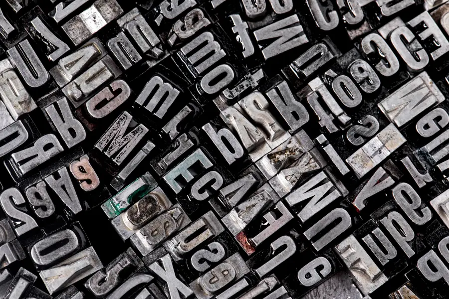
En su forma más básica, de acuerdo con los expertos de MoodWebs Perú, la tipografía se refiere al arte y técnica de seleccionar y diseñar letras y caracteres para comunicar un mensaje. Desde los primeros días de la imprenta hasta la era digital actual, la tipografía ha evolucionado enormemente, abarcando una amplia gama de estilos, técnicas y tecnologías.
La palabra «tipografía» se deriva del griego «typos» (forma) y «graphein» (escribir), lo que subraya su función esencial de dar forma a las palabras escritas. La tipografía es un campo multidisciplinario que combina aspectos de diseño gráfico, psicología cognitiva, arte y tecnología para crear una comunicación visual efectiva que MoodWebs Perú te ayuda a dominar.
Elements of Typography
1. Typography Families
Las familias tipográficas incluyen grupos de fuentes relacionadas que comparten características de diseño similares. Entre las más comunes se encuentran las fuentes serif, sans-serif, script y display. Cada familia tipográfica tiene su propia personalidad y se adapta a diferentes contextos y propósitos. MoodWebs Perú te detalla las principales características de estas tipografías.
Serif Fonts: Characterized by small adornments at the ends of letters, such as Times New Roman or Georgia. This typography is often associated with a formal and traditional look.
Sans-serif Fonts: Lack adornments and extra lines, such as Arial or Helvetica. This typography is known for its clean and modern look, ideal for contemporary designs.
Script Fonts: Mimic handwriting and are often elegant and ornate, such as Brush Script or Pacifico. These fonts are often used to add warmth and personality to designs.
Display Fonts: Designed for titles and headers, these fonts are often eye-catching and creative, such as Impact or Lobster. This typography is used to add emphasis and attract the viewer’s attention.
2. Size and Spacing
El tamaño de la tipografía y el espaciado entre letras y líneas son aspectos críticos que afectan la legibilidad y la estética de un diseño desde la experiencia de MoodWebs Perú. El tamaño adecuado de la tipografía garantiza que el texto sea fácilmente legible, mientras que el espaciado adecuado mejora la claridad y la cohesión del diseño en su conjunto. Veamos un poco más en detalle con ayuda del equipo de MoodWebs Perú.
Typography Size: Measured in points (pt), it affects the visibility and impact of the text. A font size that is too small can make reading difficult, while one that is too large can overwhelm the viewer.
Letter Spacing (Tracking): Controls the distance between each letter and affects the readability and visual aesthetics of the text. Proper letter spacing makes reading easier and improves the overall appearance of the design.
Line Spacing (Leading): Refers to the vertical space between each line of text and is crucial for ensuring readability and design cohesion. Proper line spacing prevents lines from crowding and improves the clarity of the text.
3. Weight and Thickness
El peso y el grosor de una fuente pueden variar significativamente, desde ligero y delgado hasta negro y extra-negro. Estas variaciones en la tipografía se utilizan para enfatizar ciertas partes del texto y crear jerarquía visual en el diseño. MoodWebs Perú aprovecha estas ligeras variaciones para brindarte la tipografía que más se ajuste a lo que tu marca quiere transmitir.
Typography Weight: Refers to the density or thickness of a font and can vary from light to bold. It is used to highlight key words and create visual contrast in the design.
Stroke Weight: Controls the thickness of the lines that form each letter and affects the readability and aesthetic appearance of the text. An appropriate stroke weight ensures that the letters are clearly visible and easy to read.
4. Style and Decoration
Typography styles, such as italics, bold, or underline, add emphasis and personality to the text. Additionally, typography decorations, such as ornaments and ligatures, can enhance the aesthetics of a design.
Typography Styles: Allow specific parts of the text to stand out and add visual emphasis. For example, italics can be used to highlight key words or important quotes.
Typography Decorations: Add decorative details to the letters and may include ornaments, flourishes, and ligatures. These typography decorations are often used in decorative and creative designs to enhance the visual aesthetics of the text.

Importance of Typography in Graphic Design
La tipografía desempeña un papel crucial en el diseño gráfico por varias razones fundamentales. MoodWebs Perú, como expertos en marketing digital, aprovechamos el potencial de transmitir a tu audiencia que nos da la tipografía para brindarte el mejor servicio de diseño gráfico. A través de un manejo adecuado de la tipografía logramos:
1. Effective Communication
Para MoodWebs Perú, la tipografía es fundamental para transmitir mensajes de manera clara y efectiva. La elección de la tipografía adecuada puede mejorar la comprensión del contenido y captar la atención del espectador.
2. Brand Establishment
Desde la experiencia de MoodWebs Perú, la tipografía desempeña un papel crucial en la creación y mantenimiento de la identidad de marca. Una tipografía distintiva puede ayudar a diferenciar una marca de la competencia y establecer una conexión emocional con el público objetivo.
3. Creating Atmosphere and Tone
La tipografía puede influir en la percepción de un diseño, estableciendo una atmósfera específica y un tono emocional, según los expertos de MoodWebs Perú. Por ejemplo, las tipografías elegantes y serif pueden evocar un ambiente formal y clásico, mientras que las sans-serif modernas pueden sugerir algo más contemporáneo y minimalista.
4. Improving Readability
Una tipografía adecuada mejora la legibilidad del texto, lo que MoodWebs Perú considera crucial en diseños que contienen grandes cantidades de información. El espaciado entre letras, el tamaño de la fuente y el contraste con el fondo son aspectos importantes que influyen en la legibilidad y la accesibilidad del contenido.
5. Creating Visual Hierarchy
Como bien sabemos en MoodWebs Perú, la tipografía se utiliza para crear jerarquía visual en el diseño, destacando elementos importantes y organizando la información de manera clara y coherente. Mediante el uso de diferentes tamaños, pesos y estilos de tipografía, se puede guiar al espectador a través del contenido y resaltar las partes más relevantes.
6. Emotional and Aesthetic Impact
Las fuentes tienen el poder de evocar emociones y crear una impresión duradera en el espectador desde la experiencia de MoodWebs Perú. Una tipografía elegante y bien diseñada puede añadir un toque de sofisticación y estilo a un diseño, mientras que una fuente más audaz y llamativa puede generar un impacto visual inmediato y emocional.
7. Adaptation to Different Media and Formats
La tipografía debe adaptarse a una variedad de medios y formatos, desde impresión tradicional hasta diseño digital y móvil, como bien maneja el equipo de MoodWebs Perú. La legibilidad y la coherencia del diseño deben mantenerse en todas las plataformas para garantizar una experiencia de usuario óptima.
Success Cases in Typography Use in Digital Marketing
La tipografía desempeña un papel crucial en el éxito de muchas marcas en el ámbito del marketing digital y MoodWebs Perú conoce bien este aspecto. A continuación, los expertos de MoodWebs Perú te presentan algunos casos destacados para que entendamos el valor de la tipografía.
A. Coca-Cola: The Power of Iconic Typography
Coca-Cola is known for its iconic logo, which has used the same distinctive typography for decades. The "Spencerian Script" font evokes a sense of familiarity and nostalgia, strengthening the brand’s emotional connection with its consumers. Through digital marketing, Coca-Cola has skillfully leveraged this iconic typography to create memorable and recognizable campaigns worldwide.
B. Airbnb: Personality Through Typography
Airbnb uses typography as a tool to express its personality and brand values. The "Circular" font has become a distinctive element of its visual identity, conveying a sense of modernity, accessibility, and sophistication. In its digital marketing campaigns, Airbnb skillfully integrates this typography into its design to communicate a unique and welcoming travel experience.
C. Nike: Visual Impact with Bold Typography
Nike is known for its bold and dynamic use of typography in digital marketing. The brand uses fonts like "Futura" and "Helvetica" to convey a message of energy, determination, and empowerment. Through creative visual campaigns on digital platforms, Nike harnesses the power of bold typography to inspire its followers and foster a sense of community and self-improvement.

D. Spotify: Personalization and Typography Variety
Spotify employs a wide variety of fonts in its digital marketing to adapt to different contexts and audiences. From serious and elegant fonts to more youthful and playful options, Spotify customizes typography according to the content and target audience. This strategy allows the brand to remain relevant and attractive in a diverse and competitive market.
La tipografía en MoodWebs Perú: Un enfoque profesional y creativo
MoodWebs Perú, una agencia de marketing digital y diseño gráfico líder en la industria, reconoce la importancia crítica de la tipografía en todos sus proyectos. Con un equipo de diseñadores talentosos y experimentados, MoodWebs Perú se especializa en la selección y aplicación experta de tipografía para crear diseños impactantes y efectivos.
A. Investigación y análisis de MoodWebs Perú
Antes de comenzar cualquier proyecto, el equipo de MoodWebs Perú realiza una investigación exhaustiva y un análisis detallado de los objetivos del cliente, el público objetivo y el contexto del diseño. Esto incluye la evaluación de las tendencias actuales del diseño, las preferencias de la audiencia y las mejores prácticas en tipografía.
B. Selección y personalización de fuentes de MoodWebs Perú
Una vez que se comprenden los requisitos del proyecto, los diseñadores de MoodWebs Perú seleccionan cuidadosamente las fuentes que mejor se adapten al estilo, la voz y la intención del diseño. Se pueden utilizar fuentes estándar de alta calidad o, en algunos casos, se pueden personalizar fuentes existentes o crear nuevas fuentes a medida para satisfacer las necesidades específicas del cliente.
C. Integración creativa en el diseño en MoodWebs Perú
La tipografía se integra creativamente en todos los aspectos del diseño, desde logotipos y marcas hasta sitios web y materiales impresos. En MoodWebs Perú, se presta especial atención a la jerarquía visual, la legibilidad y la coherencia estilística para garantizar que el mensaje del cliente se comunique de manera efectiva y memorable.
D. Pruebas y optimización en MoodWebs Perú
Una vez que se completa el diseño inicial, se realizan pruebas exhaustivas para evaluar la legibilidad, la estética y la usabilidad de la tipografía en diferentes contextos y dispositivos. En MoodWebs Perú, se realizan ajustes según sea necesario para garantizar que la tipografía funcione de manera óptima y cumpla con los objetivos del proyecto.
Typography Trends in Digital Marketing
MoodWebs Perú se preocupa por brindarte un servicio que se mantenga a la vanguardia de las últimas tendencias en tipografía. Nuestros expertos se dedican a mantener a tu marca actualizadas y fresca. Veamos algunas de las tendencias en tipografía que ponemos a tu disponibilidad.
1. Kinetic Typography
Kinetic typography, which combines movement and text, is gaining popularity in digital marketing. Brands like Google and Apple are using this technique to create ads and interactive content that captures the viewer's attention and communicates messages in a dynamic and memorable way.
2. 3D Typography and Augmented Reality
With the advancement of technology, 3D typography and augmented reality are emerging as significant trends in digital marketing. Brands like IKEA and Adidas are using these techniques to create immersive and engaging experiences that allow consumers to interact with content in an entirely new way.
3. Typography Personalization
Typography personalization is another growing trend in digital marketing. Brands are using generative design tools and algorithms to create unique, customized fonts that adapt to users' individual preferences. This strategy allows brands to stand out in a crowded market and establish deeper connections with their audience.
Typography is an essential element of graphic design that plays a fundamental role in effective communication, brand identity, and user experience. It is important to select and apply typography carefully and strategically to ensure that the desired message is conveyed and the design objectives are achieved.
En MoodWebs Perú, la tipografía se considera con el respeto y la atención que merece, como un componente crucial de cada proyecto de diseño. Mediante un enfoque profesional y creativo, MoodWebs Perú crea diseños impactantes y memorables que destacan en un mercado cada vez más competitivo.
In summary, typography is much more than just letters on a page; it is a powerful tool that can transform an ordinary design into something extraordinary. With a deep understanding of its principles and practices, designers can fully harness the potential of typography to create captivating and meaningful visual experiences.
Frequently Asked Questions
Why is typography important in graphic design?
Typography plays a fundamental role in graphic design because it goes beyond simply presenting readable text. It is a powerful tool for communicating emotions, establishing a brand’s personality, and enhancing the effectiveness of the message. Proper typography can grab the viewer's attention and convey the designer's intention clearly and effectively.
¿Cuál es la función principal de la tipografía según MoodWebs Perú?
Para MoodWebs Perú, la tipografía es el medio a través del cual se seleccionan y diseñan letras y caracteres para comunicar mensajes de manera efectiva. Es el arte de dar forma a las palabras escritas, utilizando diferentes estilos, tamaños y disposiciones para transmitir una variedad de emociones y conceptos.
What are the main typography families and their characteristics?
The most common typography families are serif, sans-serif, script, and display. Serif fonts have small adornments at the ends of the letters, conveying a sense of formality and tradition. Sans-serif fonts lack adornments and are associated with a modern and clean look. Script fonts imitate handwriting and can be elegant and ornate, while display fonts are bold and creative, designed for titles and headings.
¿Qué elementos afectan la legibilidad y estética de la tipografía según MoodWebs Perú?
The readability and aesthetics of typography are influenced by several elements, such as the font size, spacing between letters and lines, the weight and thickness of the font, and the style and decoration. Proper size and balanced spacing improve readability, while the weight and thickness of the font and decorative style affect the visual aesthetics of the text.
What is the role of typography in creating visual hierarchy in design?
Typography is used to establish a visual hierarchy in the design, highlighting important elements and organizing the information clearly and coherently. By using different sizes, weights, and typography styles, the viewer can be guided through the content and the most relevant parts can be emphasized.
¿Cómo puede la tipografía influir en la percepción de una marca según MoodWebs Perú?
La tipografía puede influir en la percepción de una marca estableciendo una atmósfera específica y un tono emocional. Por ejemplo, desde la experiencia de MoodWebs Perú, una tipografía elegante y clásica puede transmitir una sensación de lujo y sofisticación, mientras que una tipografía audaz y moderna puede sugerir innovación y dinamismo.
What emerging typography trends are impacting digital marketing?
Some emerging typography trends impacting digital marketing include kinetic typography, which combines movement and text to create ads and interactive content; 3D typography and augmented reality, which offer immersive and engaging experiences; and typography personalization, which adapts the text to the individual preferences of users.
¿Cuáles son algunos casos de éxito en el uso de tipografía en el marketing digital según MoodWebs Perú?
Examples of brands that have successfully used typography in their digital marketing strategies include Coca-Cola, Airbnb, Nike, and Spotify. These brands have used typography to establish a distinctive visual identity, communicate powerful messages, and emotionally connect with their audience.
¿Cómo aborda MoodWebs Perú la selección y aplicación de tipografía en sus proyectos de diseño gráfico?
MoodWebs Perú realiza una investigación exhaustiva de los objetivos del cliente, el público objetivo y el contexto del diseño antes de seleccionar cuidadosamente las fuentes adecuadas. Los diseñadores de MoodWebs Perú integran creativamente la tipografía en el diseño, prestando especial atención a la jerarquía visual, la legibilidad y la coherencia estilística.
Además, en MoodWebs Perú, nos enorgullece apoyarte con la selección de tipografía para tu público objetivo. Nuestro conocimiento del mismo se debe que contamos con gran presencia enn Argentina, Bolivia, Chile, Colombia, Costa Rica, Ecuador, El Salvador, España, Guatemala, Honduras, Mexico, Nicaragua, Panama, Paraguay, Peru, Uruguay and Venezuela. This allows us to provide the best typography knowledge for your brand.
¿Por qué es importante mantenerse al tanto de las tendencias en tipografía en el diseño gráfico según MoodWebs Perú?
Para MoodWebs Perú, es importante mantenerse al tanto de las tendencias en tipografía para mantener la relevancia y frescura de los diseños en un mercado en constante evolución. Mantenerse al día con las últimas tendencias permite a los diseñadores adaptarse a las preferencias cambiantes del público y destacarse en un mercado cada vez más competitivo.