

In today’s digital ecosystems, maintaining a consistent brand identity is a challenge that goes far beyond defining colors, typefaces, and logos. When an organization manages multiple websites, applications, portals, e-commerce platforms, and microsites, the identity must remain recognizable even when there are different teams, technologies, and development processes. Small differences between interfaces can accumulate to produce fragmented experiences that appear to belong to different organizations. In this context, Web Components offer an alternative for turning branding decisions into reusable, encapsulated components that can be applied across different technological environments.
Web Components are a set of standard web platform technologies that allow custom and reusable elements to be created. Among their main capabilities are Custom Elements, Shadow DOM, HTML Templates, and Slots, which can be combined to build components with defined structure, behavior, and presentation. Their value for a branding architecture lies in the fact that they allow certain design system decisions to be transferred directly into the implementation. Thus, consistency no longer depends exclusively on manuals and recommendations and becomes part of the infrastructure used by digital products.
The Branding Challenge on Complex Websites
In a small project, maintaining visual consistency is usually simple because the same team controls design, development, and publishing. The situation changes when an organization grows and multiple teams, vendors, platforms, and technologies emerge, since each group may interpret brand guidelines differently. In this context, Web Components can help establish a common foundation for implementing visual identity elements consistently. A button may use a slightly different tone, a card may have different spacing, or a form may handle error and focus states differently, but an architecture based on Web Components makes it possible to reduce these variations.
Brand identity manuals and design libraries help establish common rules, but they do not, by themselves, guarantee that those rules will be implemented correctly. A Design System reduces this gap through reusable components and patterns, although the problem of distributing them across applications built with different technologies still exists. Web Components can act as a common layer between brand identity and digital products, making it easier for the same visual and functional criteria to be maintained across different environments. Instead of individually rebuilding a button, a card, or a dialog, teams can use a centralized implementation based on Web Components.

From Design System to Brand Infrastructure
A Design System can be understood as a collection of principles, components, and patterns intended to guide the construction of interfaces. A branding infrastructure goes one step further because it turns those decisions into elements directly integrated into products through Web Components and other reusable resources. Instead of only indicating what the corporate color is, the system can define a token that is used by buttons, links, forms, and other components developed with Web Components. In this way, visual rules become part of the technical architecture and can evolve in a coordinated manner.
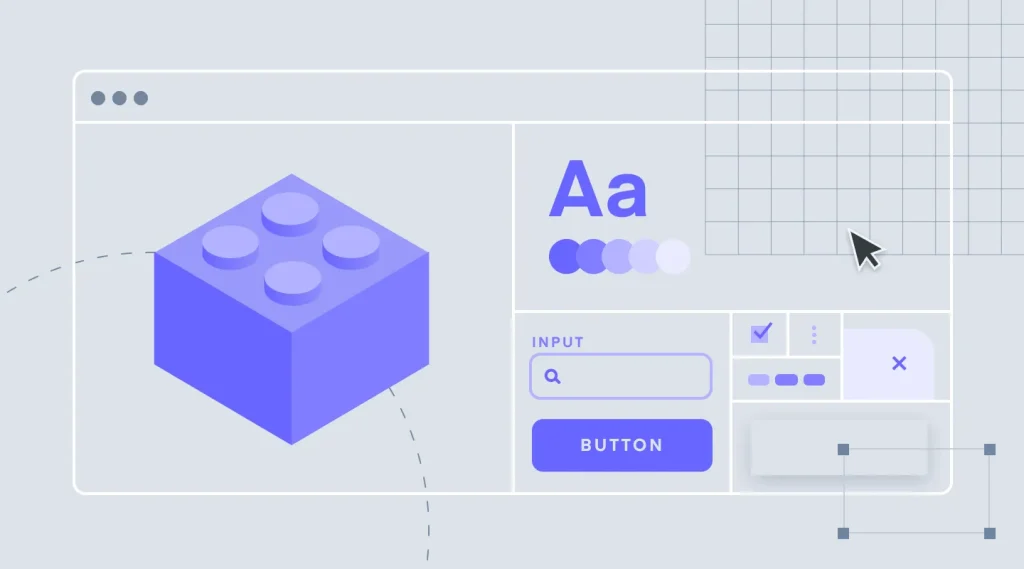
This infrastructure can be organized into different levels. The first corresponds to the foundations, such as colors, typefaces, sizes, spacing, radii, and shadows; then come basic components such as buttons, links, fields, and indicators, which can be implemented through Web Components to facilitate their reuse. Subsequently, there are composite components such as cards, menus, forms, and dialogs, which can also form part of a Web Components library. This structure makes it possible to maintain a common core without forcing all sites to use exactly the same pages, while each product retains the ability to respond to its particular needs.
Web Components as a Base Technology
Web Components are particularly interesting because they are not an application framework. Custom Elements makes it possible to create new HTML elements and associate them with a specific implementation, so they can be used within a page as custom elements. An organization could define elements such as brand-button, brand-card, or brand-dialog and establish within them the rules that must remain consistent. This makes it possible to create a cross-cutting Web Components library that does not depend completely on a technology such as React, Vue, or Angular.
This independence is useful in companies where applications developed at different times coexist. A corporate portal may use one technology, a customer platform another, and an editorial site may be based on a CMS, while all of them consume common components through Web Components. This reduces the need to rebuild the visual system every time the technology used by a team changes. Although each environment may require certain integration considerations, the foundation of Web Components remains supported by standard web capabilities.
Shadow DOM and Encapsulation
One of the common problems with shared libraries is that the styles of an application can interfere with external components. In a traditional CSS architecture, a general selector can accidentally modify a component, or an internal rule can conflict with existing styles on the site. Shadow DOM provides an encapsulation mechanism that maintains a separate internal structure from the main DOM and is especially useful when implementing Web Components. This reduces the possibilities that an application's code will inadvertently modify the internal implementation of a component and helps maintain the consistency of Web Components across different sites.
For a branding architecture, this feature is especially important. An official button developed as a Web Component can preserve its structure, states, and styles without depending on the global rules of the site where it is used. However, encapsulation should not mean absolute isolation, because certain values must respond to the brand's general decisions. The combination of Shadow DOM with tokens and custom CSS properties makes it possible to protect the implementation of Web Components while, at the same time, maintaining controlled theming mechanisms.
Design Tokens as a Contract
Design tokens are a fundamental part of a modular branding architecture and also play an important role in building consistent Web Components. Instead of distributing specific values for color, typography, spacing, or size among multiple components, variables with semantic meaning can be defined. A button implemented as a Web Component can use the token corresponding to the brand's primary color instead of directly containing a hexadecimal value. If the identity changes, the system can update the token definition without having to manually modify each Web Component.
This principle can be applied to colors, typeface families, weights, sizes, line heights, spacing, radii, and shadows. Tokens function as a common language between designers and developers and help reduce different interpretations when creating Web Components for different products. They can also facilitate the existence of several brand expressions when an organization manages sub-brands that share components but need different visual configurations. The brand can evolve without requiring the architecture or the Web Components that make it up to be completely rebuilt.
Templates and Slots to Maintain Flexibility
Consistency does not mean that all Web Components must be completely rigid. An excessively closed system can make it difficult to create specific experiences and lead teams to develop parallel solutions. HTML Templates makes it possible to define reusable structures, while Slots make it possible to insert content within previously established spaces in Web Components. This facilitates the creation of components that maintain a common visual structure without completely controlling the content.
A card can internally establish its hierarchy, spacing, borders, and behavior through a Web Component, while allowing each product to provide a title, a description, and certain actions. In this way, the brand controls how the information is presented while the product controls what information it presents within the Web Component. This balance is important on complex sites because different areas of an organization may manage very different content. The architecture must establish common rules without preventing teams from taking advantage of the flexibility of Web Components to address legitimate needs.
Layered Modular Architecture
An enterprise implementation can begin with a core of tokens that represents the foundations of the brand. Basic Web Components, such as buttons, links, fields, labels, and indicators, are built on top of this core and can subsequently be combined to form more complex elements. A third layer can contain cards, dialogs, menus, navigation, and forms, while products can maintain specific components related exclusively to their domain. This separation makes it possible to organize Web Components by levels and prevents the Brand System from becoming a gigantic and difficult-to-maintain library.
Not every visual element should become a central Web Component. Components should be incorporated when they have sufficient reuse, importance for the identity, shared complexity, or a need for consistent behavior. If every particular need ends up inside the central Web Components library, the system accumulates exceptions and increases its maintenance costs. Modularity works best when there is a clear boundary between the Web Components that belong to the brand and those that respond exclusively to the needs of each product.
Compatibility with Different Technologies
Independence from a specific framework is one of the main strategic advantages of Web Components. Large organizations often maintain applications developed at different times and with different technologies, so a complete migration toward a single platform can be costly. A system based on Web Components can provide a common layer that crosses these applications and allows the same brand elements to be reused. This allows branding to evolve with greater independence from the technological decisions of each product.
Interoperability, however, does not mean that all environments will work exactly the same way without adaptation. It is necessary to establish clear contracts for attributes, properties, events, content, and composition of Web Components. Naming conventions and rules must also be defined to allow these components to be used without knowing their internal implementation. A coherent API is as important as the visual appearance because it determines how Web Components will be adopted, integrated, and maintained in the long term.
Accessibility as Part of the Brand
Accessibility should be considered an essential characteristic of digital branding and a fundamental responsibility of Web Components. If an organization provides a centralized button, that Web Component should correctly address focus, keyboard navigation, interactive states, and the necessary semantics. The same applies to forms, dialogs, menus, error messages, and other elements that interact directly with the user. Centralizing these responsibilities allows an accessibility improvement applied to Web Components to benefit numerous products at the same time.
This advantage also implies considerable responsibility. An error within a central Web Component can be reproduced across many pages and applications, so quality must be part of the development cycle. Testing should consider keyboard, screen readers, contrast, different screen sizes, and interaction states to ensure that Web Components function correctly in different contexts. Accessibility should not be a review performed after implementation, but rather a property included from the definition and development of each component.
Performance and Distribution
A shared library does not by itself guarantee better performance. If an application has to load a large amount of code even though it only uses a few Web Components, the system may introduce unnecessary costs. Therefore, the architecture should consider a modular distribution that allows only the necessary pieces to be loaded. It is also advisable to differentiate Web Components that require JavaScript from those that can function primarily through HTML and CSS.
The distribution strategy should consider the size of dependencies and the way Web Components are updated. A branding library should reduce duplication without introducing an excessively complex chain of resources. Modern web platform capabilities can also be leveraged to combine Web Components with server-side rendering strategies when the project requires it. The goal is to achieve reuse and consistency without turning the library into an unnecessary burden for each page.
Progressive Integration
Most organizations cannot immediately replace all of their existing sites. It is common to find CMSs, legacy applications, commercial platforms, and projects developed by external vendors that must continue to function. In these cases, progressive adoption makes it possible to introduce Web Components without requiring a complete reconstruction of the ecosystem. Components can begin to be used in specific areas and temporarily coexist with existing solutions.
An initial strategy can focus on high-frequency elements, such as buttons, links, fields, alerts, and navigation. Afterwards, composite Web Components and more complex patterns can be incorporated as the library demonstrates its stability. This methodology makes it possible to identify integration problems before extending the system throughout the organization. It also makes it easier for teams to progressively become familiar with the new architecture and reduce their dependence on legacy components.
Documentation and Governance
A Web Components system needs clear documentation to be sustainable. It is not enough to indicate the available properties, because teams also need to know when to use a component, what variants exist, and what uses should be avoided. The documentation should explain states, responsive behavior, accessibility, composition, and usage criteria for Web Components. It should also communicate the design intent so that the restrictions are understandable and can be applied correctly.
Governance determines how the Web Components library evolves. There should be rules for proposing components, reviewing modifications, approving variants, and managing versions. Not all product needs should automatically be incorporated into the central system, because this can generate a library that is difficult to maintain. The objective is to preserve a core of truly cross-cutting Web Components and prevent particular exceptions from becoming general standards.
Testing and Regression Control
When a Web Component is used across multiple sites, any modification can produce effects much broader than those of an element developed exclusively for a single page. For this reason, testing should be part of the normal development cycle of the Brand System. Tests should cover behavior, accessibility, interactive states, and visual appearance of Web Components. Visual regression tests also help detect unintended changes in sizes, colors, typefaces, and spacing.
It is also necessary to test situations that can considerably modify the experience. Long texts, translations, small screens, unexpected content, and different combinations of Web Components can reveal problems that do not appear during a basic test. A component should be considered ready when it responds consistently to these scenarios. In this way, the library is managed as a software product and not as a simple collection of visual resources.
Migration Strategy
The first step in a migration is to carry out an inventory of the digital ecosystem. The sites, technologies, existing components, visual inconsistencies, and elements that have the greatest impact on the experience should be identified. Based on this analysis, the first tokens and Web Components that will form part of the new system can be selected. Priority should be given to frequent and strategic elements, not necessarily to the most complex Web Components.
Afterwards, a first version of the brand core can be created and tested in representative products. These projects make it possible to discover integration problems, adjust the APIs, and assess the teams' acceptance of the Web Components. Once the system has stabilized, it can be progressively expanded to other sites and the retirement of legacy components can begin. Coexistence between both architectures may be necessary for a period, but there should be a clear strategy for completing the transition to Web Components.
Mistakes That Should Be Avoided
One of the most frequent mistakes is turning every element of an interface into a central Web Component. Reuse alone does not justify creating a component, because each element involves maintenance, documentation, testing, and versioning. The creation of Web Components that are too large and mix brand rules with specific business logic should also be avoided. The architecture should maintain a clear separation between cross-cutting infrastructure and particular needs.
Another mistake is allowing too many exceptions. If each team can freely modify the appearance of Web Components, the system loses its purpose and reproduces the problems it was intended to solve. It is also incorrect to assume that encapsulation means that a Web Component does not need theming mechanisms. The architecture should protect the internal implementation while, at the same time, providing controlled ways to apply global brand decisions.

The implementation of Web Components provides a solid foundation for building a modular and consistent branding architecture in complex digital ecosystems. Custom Elements makes it possible to create custom components, Shadow DOM provides encapsulation, and Templates and Slots facilitate reusable structures with different levels of flexibility. These capabilities make it possible to transfer essential elements of visual identity directly into a shared technical infrastructure. The result can be greater consistency across sites, applications, and teams without requiring everyone to use exactly the same technology.
Success, however, does not depend solely on adopting Web Components. A sustainable architecture needs design tokens, well-defined APIs, accessibility, testing, documentation, governance, versioning, and a progressive migration strategy. It also needs clear boundaries to prevent the system from becoming an excessively large or rigid library. When these elements work together, the brand can evolve in a coordinated manner while products maintain the flexibility necessary to respond to their own objectives.
Ultimately, the purpose is not to make all interfaces identical, but rather to make them recognizable as part of the same identity. Web Components make it possible to turn essential elements of the brand language into reusable pieces, while tokens and governance rules provide the structure necessary to keep them consistent. If you are looking to develop a solid digital strategy, at MoodWebs we can help you with design, web development, and digital solutions tailored to the needs of your project. To learn about our services, you can write to [email protected] and speak with our team about your next project.
 EN
EN  ES
ES